
Menu
Menu

Product Design
Brightspeed
Product Design
Brightspeed
About
Brightspeed is one of the largest internet providers in the United States, focused on delivering high-speed broadband to underserved communities. As part of the Level Studios creative team, I had the opportunity to play an integral role in rebuilding and evolving their digital experience. From establishing a scalable and continuously evolving design system to reimagining key product flows, I contributed to several critical initiatives aimed at simplifying, enhancing, and refining Brightspeed’s user experience.
Brightspeed is one of the largest internet providers in the United States, focused on delivering high-speed broadband to underserved communities. As part of the Level Studios creative team, I had the opportunity to play an integral role in rebuilding and evolving their digital experience. From establishing a scalable and continuously evolving design system to reimagining key product flows, I contributed to several critical initiatives aimed at simplifying, enhancing, and refining Brightspeed’s user experience.
Brightspeed is one of the largest internet providers in the United States, focused on delivering high-speed broadband to underserved communities. As part of the Level Studios creative team, I had the opportunity to play an integral role in rebuilding and evolving their digital experience. From establishing a scalable and continuously evolving design system to reimagining key product flows, I contributed to several critical initiatives aimed at simplifying, enhancing, and refining Brightspeed’s user experience.
Client
Brightspeed
Category
Product Design
,
Web Design
Year
2022 — Present

01 — Design System Overhaul
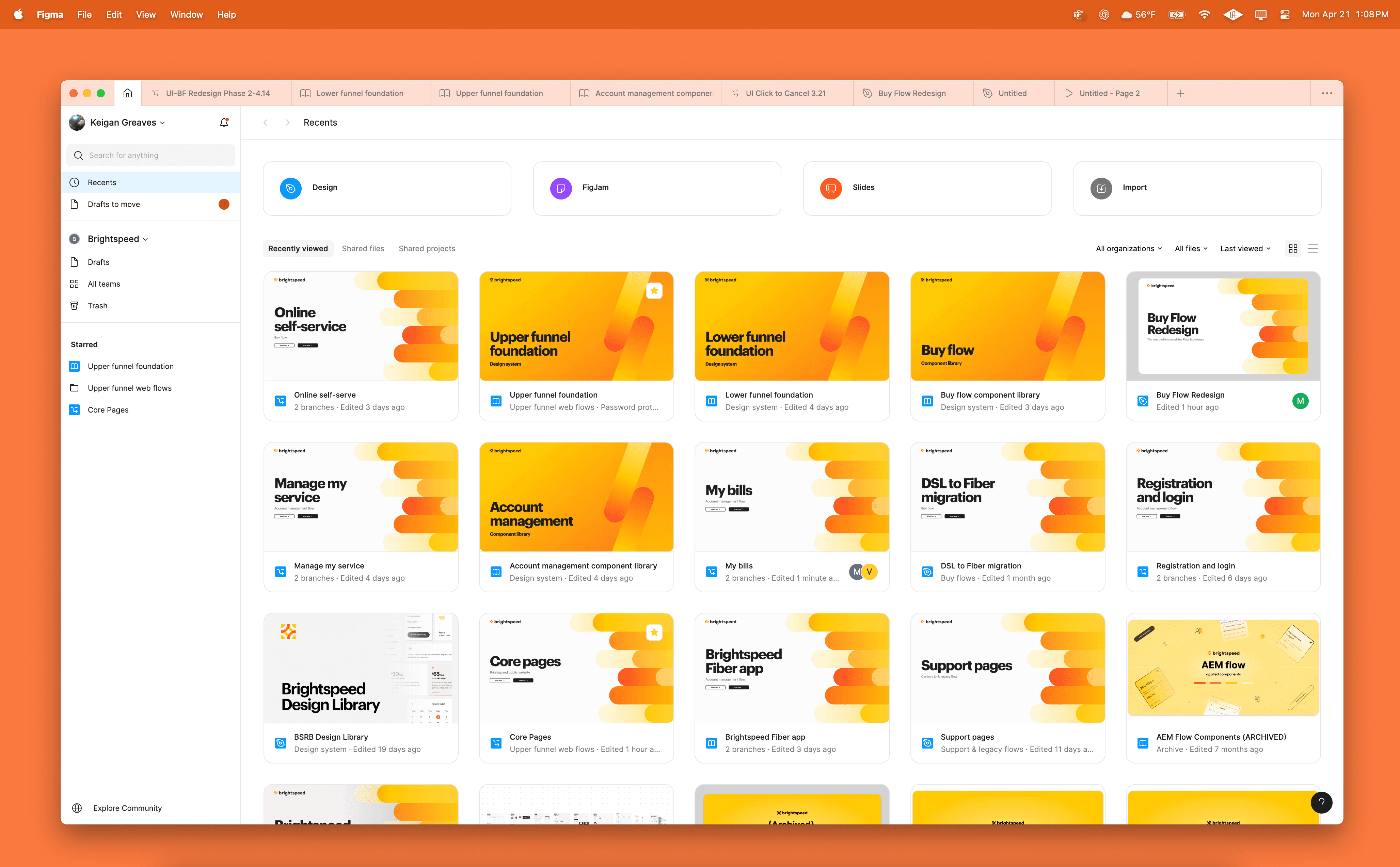
With Brightspeed’s rapid growth and evolving digital needs, we were tasked with creating an all-encompassing, future-proof design system capable of housing both web and mobile components. As part of our migration from Sketch to Figma, I contributed to the effort of rebuilding every single component in our previous Sketch library with Figma's Auto-layout settings. We were able to apply atomic design principles and focus more on establishing a structured parent/child library organization to prioritize structure, consistency, and ease of use.
This overhaul not only improved our ability to meet tight deadlines, but also aligned the UI team more closely with the client's product team and development. We were then able to participate in weekly stand-ups, where we could track, align and monitor the developers' process to promote alignment with our design system. The result was an efficient system that enhanced collaboration, reduced design debt, and increased design production, enabling the efficient handoff of final components to developers.
Today, the Brightspeed system houses over 400 components—everything from product cards and promotional banners to comparison charts and interactive modules. Among the vast library, we were also tasked with implementing their brand identity system that defines their core elements, such as color, typography, iconography and logo treatments.
Shifting to a single source of truth, we eliminated the need for fragmented workflows tied to tools like PowerPoint and Zeplin. What once required multiple platforms is now streamlined within Figma, making design reviews more dynamic, feedback loops tighter, and the system far more equipped to grow with the business.

02 — System Redesign
The full Brightspeed experience was redesigned with the goal of redesigning the interface, strengthening interactions, and introducing remastered components that could better communicate Brightspeed’s tone of voice across multiple flows and future features. Working closely with stakeholders and creative directors, we moved through several rounds of exploration and iteration, during which we established new layout patterns, interaction behaviors, and content structures.
My role as a UI designer was truly tested. At that point, I needed to contribute not only to the visual hierarchy and aesthetic of Brightspeed but also to how the new redesign system should be structured, tested, and deployed. The visual system we built and aligned on now exists as an intersection of all of our proposed aesthetics and what Brightspeed perceives—and now validates through increased revenue—as aligned with the brand’s future.
The design library has now expanded with over 300 newly redesigned components. This brings the Brightspeed design system to more than 700 components currently in use across its digital landscape. With this expansion, the brand identity was redefined through the introduction of new typography, refreshed color palettes, and a strict spacing system. We leveraged foundational elements from our previous Brightspeed system and transformed them into an impenetrable system by utilizing Figma’s variable features.
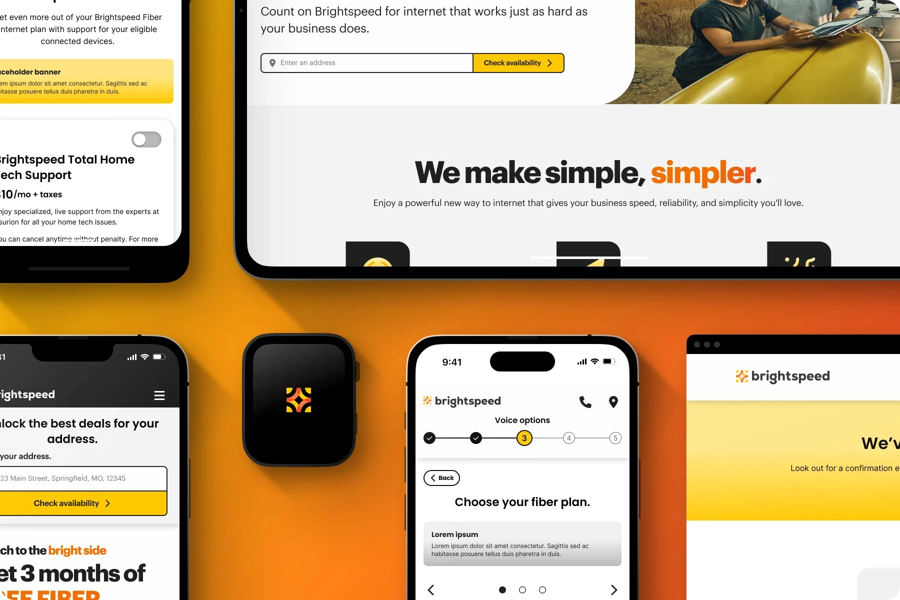
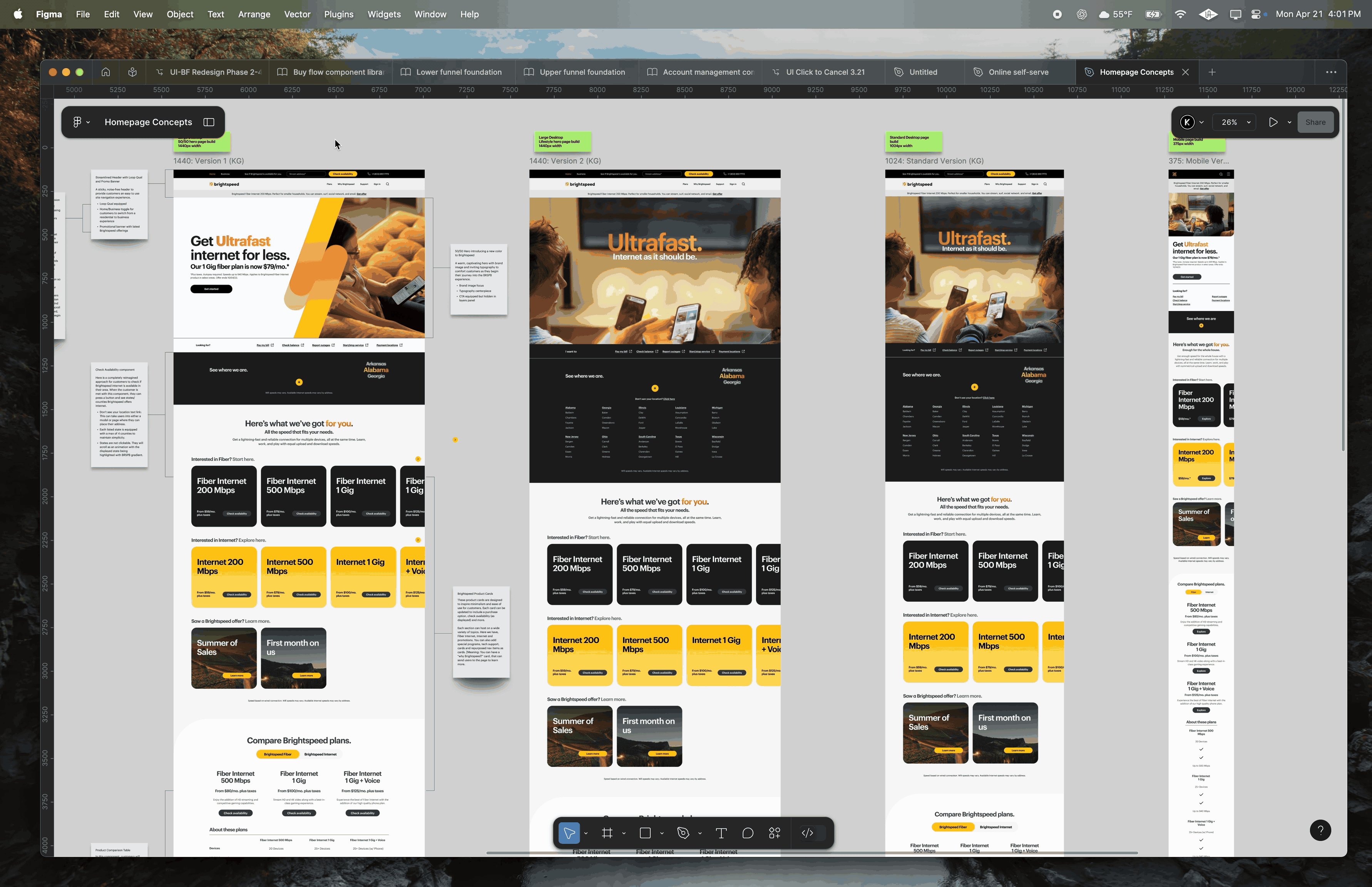
The examples above highlight how these redesigned components manifest across the Brightspeed experience. The first collaged image showcases updates to the homepage and Buy Flow. The second image includes the page builds I designed for our Design Challenge, which contributed to shaping the visual and structural direction of the site. I was tasked, along with two other UI designers, to create our ideal vision for Brightspeed’s website, and those layouts reflect the design solutions I arrived at by the end of our sprint. The final image presents a live snapshot of Brightspeed’s new mobile experience, entirely constructed using the newly developed component library.
The design library has now expanded with over 300 newly redesigned components. This brings the Brightspeed design system to more than 700 components currently in use across its digital landscape. With this expansion, the brand identity was redefined through the introduction of new typography, refreshed color palettes, and a strict spacing system. We leveraged foundational elements from our previous Brightspeed system and transformed them into an impenetrable system by utilizing Figma’s variable features.
The examples above highlight how these redesigned components manifest across the Brightspeed experience. The first collaged image showcases updates to the homepage and Buy Flow. The second image includes the page builds I designed for our Design Challenge, which contributed to shaping the visual and structural direction of the site. I was tasked, along with two other UI designers, to create our ideal vision for Brightspeed’s website, and those layouts reflect the design solutions I arrived at by the end of our sprint. The final image presents a live snapshot of Brightspeed’s new mobile experience, entirely constructed using the newly developed component library.

03 — Buy Flow Redesign
Another major initiative I contributed to was the redesign of Brightspeed’s Buy Flow. This experience is a critical component of the user journey and had long been a consistent source of user friction. After several rounds of usability testing and stakeholder consultations to identify key pain points, our team reimagined the flow using a phased, multi-page layout that replaced the outdated accordion-style interface. The previous accordion system was replaced with a set of newly developed progress trackers designed to clearly define each step required for the user to successfully configure their Brightspeed plan.
As our UX designers spearheaded research, flow planning, and structural development, the UI team worked in lockstep to ensure that each design directly satisfied the clients’ needs and respected the capabilities of our new design system. My focus was on translating UX wireframes into atomic-level screen designs.
Identifying new component build opportunities, updating existing components, or retiring outdated builds was typically my first step. These foundational decisions subsequently informed the creation of high-fidelity screens, which were constructed using page-level master components. Each screen contained the components relevant to a specific step within the Buy Flow process. From Step 1 through Step 5, each design was configured to support modular, plug-and-play functionality. In addition to leading a concurrent redesign of the Buy Flow, this new approach contributed to a 4.5% increase in Value-Added Services attach rates.
Identifying new component build opportunities, updating existing components, or retiring outdated builds was typically my first step. These foundational decisions subsequently informed the creation of high-fidelity screens, which were constructed using page-level master components. Each screen contained the components relevant to a specific step within the Buy Flow process. From Step 1 through Step 5, each design was configured to support modular, plug-and-play functionality. In addition to leading a concurrent redesign of the Buy Flow, this new approach contributed to a 4.5% increase in Value-Added Services attach rates.
Identifying new component build opportunities, updating existing components, or retiring outdated builds was typically my first step. These foundational decisions subsequently informed the creation of high-fidelity screens, which were constructed using page-level master components. Each screen contained the components relevant to a specific step within the Buy Flow process. From Step 1 through Step 5, each design was configured to support modular, plug-and-play functionality. In addition to leading a concurrent redesign of the Buy Flow, this new approach contributed to a 4.5% increase in Value-Added Services attach rates.

Web Design
Ethereal Elixirs
Web Design
Ethereal Elixirs
Web Design
Ethereal Elixirs
Contact
Let’s work.
Excited and open to new opportunities to craft equitable and meaningful experiences.
Keigan Greaves, Product Designer
Contact
Let’s work.
Excited and open to new opportunities to craft equitable and meaningful experiences.
Keigan Greaves, Product Designer
Contact
Let’s work.
Excited and open to new opportunities to craft equitable and meaningful experiences.
Keigan Greaves, Product Designer